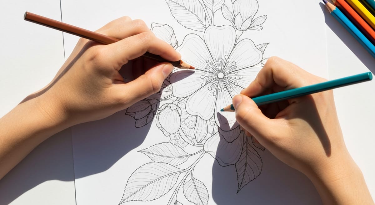
Cómo colorear flores: consejos para conseguir pétalos, hojas y ramos realistas
Todo lo que necesitas saber para colorear flores de forma realista: sombreado de pétalos, técnicas para las hojas, dirección de la luz, paletas de colores, errores comunes y los mejores materiales.
The first flower I colored as an adult was a rose. I picked red (obviously), filled in every petal with the same flat shade, and sat back expecting it to look like something from a botanical garden.
It looked like a red blob. A cheerful red blob, sure, but there was zero depth. No sense that petals were curving or overlapping. No light hitting one side more than the other. Just... red.
I almost gave up on flowers entirely and went back to mandalas, where symmetry does half the work for you. But then I watched a time-lapse of someone coloring a peony, and I realized the difference wasn't talent. It was technique. They were treating each petal as its own little zone of light and shadow, not just a shape to fill in.
That was about two years ago. Since then, flowers have become my favorite thing to color. They're forgiving since organic shapes hide small mistakes, and they come in endless variety. A well-colored flower page looks great on a fridge or in a frame. This is what I've figured out about making flowers look alive on the page.
Why flowers are a different kind of challenge
Most coloring subjects have at least some straight lines or hard edges. Buildings have walls. Cars have panels. Even animals have defined outlines for legs and ears.
Flowers have almost none of that. Petals curve and overlap in unpredictable ways. Leaves twist. Stems bend. Nothing is perfectly symmetrical, which is part of their appeal and part of the difficulty.
The other thing about flowers is how light interacts with them. Petals are slightly translucent. Light doesn't just bounce off a petal the way it bounces off a car hood. It passes through a little bit, creating a glow effect at thin edges. Leaves have a waxy surface that catches light differently on top versus underneath. Stems are matte and cylindrical, so they need a completely different shading approach than flat petals.
If you've been coloring everything with the same even pressure and single-color fills, flowers are where that approach falls apart. A few specific techniques solve most of these problems, and they're not hard to learn.
Flower anatomy for colorists (not botanists)
You don't need a botany degree, but understanding basic flower structure helps you make better coloring decisions.
Petals aren't flat. They cup inward toward the center of the flower, especially in roses, tulips, and peonies. That cupping creates a shadow on the inside of each petal, even in bright light. When you look at a real flower, the base of each petal (where it connects to the center) is darker than the tip. Coloring this way makes flowers look three-dimensional instead of flat.
Petals also overlap. In a rose, some petals sit in front of others. Where one petal casts a shadow on the one behind it, the back petal gets darker. This layering is what gives roses that rich, deep look. If you color every petal the same value, you lose all of that depth.
Leaves have a central vein that divides them into two halves. These halves aren't identical. One side catches more light than the other, depending on the leaf's angle. The veins themselves are slightly raised, which creates tiny shadow lines. And leaf edges often curl or fold, creating more light-dark variation.
Stems are cylinders. Light hits one side, the other side is in shadow, and there's a reflected light along the very edge of the dark side. Same principle as coloring a tree trunk, actually. If you enjoy coloring tree pages, you already know this shading approach.
Petal techniques that make the biggest difference
This is the core of flower coloring. Get petals right and the whole flower comes together.
Start with a light base layer
Before you do anything fancy, lay down a light, even base layer across the entire petal. If you're coloring a pink rose, use a very light pink or even a peach. Keep the pressure low. You should see paper grain through the color.
This base layer does two things. It unifies the petal so your subsequent shading doesn't look disconnected. And it gives you a safety net, because building up from light is always easier than trying to lighten something that's too dark.
Pick a light direction and commit to it
This is the single most important thing you can do for realistic flowers. Decide where the light is coming from (top-left is the most natural and common choice) and then stay consistent across every petal, every leaf, and every stem.
The side of each petal facing the light gets lighter colors and less pressure. The side facing away from the light gets deeper shades and more layers. It sounds obvious when I type it out, but I see it ignored constantly. A flower with consistent lighting looks much better than one with random shading, even if the random shading is technically more skilled.
Shadow the cups and folds
Where a petal curves inward (the cup), add a deeper shade. Where two petals meet, the crease between them is a shadow line. Use your darkest value here, but apply it in a narrow strip and then blend outward so it fades naturally into the mid-tone.
For roses, this means the very center of the flower is quite dark. Each ring of petals gets progressively lighter as you move outward. The outermost petals, which are fully open and catching the most light, are the lightest.
Highlight the edges
Real petals are thinnest at their edges. Light passes through or catches the edge, making it the brightest part of the petal. Leave the very edge of each petal lighter than the middle. You can even leave a thin strip of white (the paper itself) along the top edge of forward-facing petals.
It's a small detail, but it makes a real difference. It separates petals from each other visually and creates that translucent, delicate look that real flowers have.
Build color variation within a single petal
A red rose petal isn't just red. Look at a real one. The base might be a deep crimson. The middle transitions to a true red. The edge might have a pink or even yellowish tint. Depending on the variety, there could be orange or purple undertones.
Even if you're working with a coloring page that has simple outlines, you can create this variation. Start with your darkest shade at the petal base, transition to your mid-tone in the middle, and use your lightest shade near the tips. Three shades of the same color family, applied in zones, transform a flat petal into something that looks almost real.
If you've read our guide to blending colored pencils, this is a perfect place to use those techniques. Light layering and a colorless blender pencil are especially effective on petals because the small areas are easy to control.
Leaf techniques
Leaves are often an afterthought. People spend 45 minutes perfecting rose petals and then fill in the leaves with one flat green in 30 seconds. Don't do that. Well-colored leaves make the flowers pop.
Use the central vein as your guide
The main vein down the middle of a leaf is your dividing line. Color one side slightly darker than the other. Which side depends on your light direction (the side facing away from the light is darker). This simple split instantly makes leaves look three-dimensional.
For the smaller veins that branch off the central one, leave thin lines of lighter color, or go over them after with a lighter green pencil. You don't need to be precise. Just a suggestion of vein structure adds realism.
Mix your greens
This is where a lot of colorists go wrong. They grab one green pencil and use it for every leaf on the page. Real plants have enormous green variation. Newer leaves are yellow-green. Older leaves are blue-green. Leaves in shadow lean toward blue. Leaves in sun lean toward yellow.
Use at least two greens on every leaf: a warm yellow-green and a cool blue-green. Layer the warm green on the light-facing side and the cool green on the shadow side. The contrast creates depth without requiring much skill. Just two colors, used deliberately, look better than one color used perfectly.
On top of that, adding a tiny bit of brown or red at the base where the leaf meets the stem makes the transition look natural. Real leaves aren't green all the way to the connection point.
Stems and backgrounds
Stems are cylinders, so shade them like cylinders. One side light, the other side darker, with a thin strip of medium tone at the very edge of the dark side (that's reflected light bouncing off the environment). Use a warm brown or olive mixed with your greens rather than pure green.
For thorns on rose stems, leave small pointed shapes uncolored or very lightly colored. The thorns catch light and stand out slightly.
Backgrounds depend on the page. Some flower coloring pages have no background, and that's fine. If there is background space, you have options. A light wash of sky blue or a very soft yellow suggests sunlight without competing with the flowers. Avoid coloring the background as dark as the flowers themselves. The flowers should be the stars.
If you're coloring a bouquet in a vase, the vase and table surface need their own shading. Glass vases are fun because you can show the stems through the glass with lighter, muted colors. But that's an advanced move. A simple solid-colored vase with basic light-dark shading works perfectly.
Color palettes beyond the obvious
Red roses are the default, but flowers come in almost every color combination. Branching out makes your finished pages more interesting and teaches you more about color relationships.
Some palettes worth trying:
Sunset dahlia: Start with deep magenta at the petal bases, transition to orange in the middle, and finish with golden yellow at the tips. Three colors, one flower, and it looks like it's glowing.
Lavender field: Use three or four shades of purple, from deep violet to pale lavender. Add grey-green leaves instead of bright green. The muted leaves let the purples carry the page.
Wildflower mix: If you're coloring a bouquet or a page with multiple flowers, give each flower a different color family but keep the leaves consistent. Yellow daisies next to blue cornflowers next to pink cosmos. Mix up the flower colors but keep all the leaves in the same green family.
White flowers (advanced): White flowers aren't white. They're pale blue in shadow, pale yellow where light hits, and only truly white at the very brightest highlights. Color a "white" gardenia using light blue, light lavender, and cream, leaving just the highest points as bare paper. It's challenging, but the result is beautiful.
For more nature-inspired coloring, our mushroom coloring pages and rainbow coloring pages are great for experimenting with unusual color combinations that you can then bring back to your flower work.
Common mistakes (and how to fix them)
The most common mistake is flat, even color everywhere. Every petal the same shade, every leaf the same green, no variation anywhere. The fix is simple: use at least two values (light and dark) of each color and pay attention to where shadows would naturally fall.
Related to that: same pressure on every stroke. Heavy pressure gives you bold, saturated color. Light pressure gives you subtle, airy tones. If you press the same amount everywhere, everything blends together into visual monotone. Practice varying your pressure within a single petal, heavier at the base and lighter at the edges.
Ignoring the light source trips up a lot of people too. Some colorists shade petals randomly, with dark spots here and there but no consistency. Pick a direction for the light and follow it on every element of the page. Top-left is the easiest starting point.
Another one I see often is outlining every petal in black. Thick dark outlines flatten the entire image. Instead, use a darker shade of the petal color along the shadow edges only. The light-facing edges should have no outline at all, or just a very faint one.
Finally, don't rush the center of the flower. Flower centers (the pistil, stamen, and the tight inner petals) are small and fiddly, so people speed through them. But the center is what the eye is drawn to first. Take your time. Use a sharp pencil. Add dots of yellow or brown for pollen details. A well-colored center makes the whole flower read as finished.
Supplies for flower coloring
Flower coloring leans heavily on shading and blending, so your tools matter more here than on simpler subjects.
I use Prismacolor Premiers because the soft core blends easily, and the 72-pack (about $45) gives you enough shade variation within each color family to color realistic petals. You'll want at least 3-4 pinks/reds, 3-4 greens, and 2-3 yellows for most flower pages. If you're starting out, the Scholar line (48-pack, about $20) is cheaper, and the firmer core actually helps with detail work on small petals and thin stems.
A colorless blender pencil (Prismacolor makes one for about $3) helps a lot with petal work. Blending petal colors smoothly is what separates flat-looking flowers from dimensional ones. And keep your pencils sharp. Flower coloring involves lots of small sections, and a dull point makes sloppy edges. I sharpen every 5-10 minutes during detailed flower work.
If you prefer markers, Tombow Dual Brush Pens work well for backgrounds and petal edges. Print on 32lb paper if you go that route, because markers bleed through standard copy paper.
If you want help choosing between different coloring tools, our guide on crayons, colored pencils, or markers breaks down which medium works best for different situations. And for a full primer on pencil techniques before you tackle flowers, check out how to color with colored pencils.
Put it into practice
Here's what I'd suggest for your first serious flower coloring session. Go to our flower coloring pages collection and pick a single-flower design (not a bouquet). A rose or sunflower with clearly defined petals works well.
Before you touch a pencil, look at the page for a minute. Decide where your light is coming from. Identify which petals are in front and which are behind. Notice where the deepest shadows would be (the center, the folds between overlapping petals, the underside of curling leaf edges).
Then start with your lightest shade and work up. Base layer first, across everything. Then mid-tones in the transition zones. Then darks in the shadows. Then blend. Then highlights. The whole process takes longer than just filling in shapes, but you'll see the difference immediately.
One flower, colored with intention, teaches you more than ten flowers colored on autopilot. Once you've done a few single flowers, try a full bouquet from our flower coloring pages. The techniques click faster than you'd expect once you've worked through a couple of single flowers.
Art Educator & Content Director
Art educator with 12+ years of classroom experience. Certified in Art Education and Child Development. Helping families and teachers unlock the power of creative play.
You Might Also Like
Cómo convertir una foto en una página para colorear (herramienta de IA gratuita)
Cómo convertir cualquier foto en una página para colorear imprimible con una herramienta de IA gratuita. Incluye los mejores tipos de fotos, instrucciones paso a paso, usos creativos y consejos para colorear páginas personalizadas.
La guía definitiva para colorear mandalas
Todo lo que necesitas saber sobre cómo colorear mandalas: cómo elegir niveles de complejidad, métodos de planificación del color, técnicas, suministros, errores comunes y cómo crear una práctica diaria.
Cómo difuminar lápices de colores: 5 métodos de básico a avanzado
Cinco métodos para difuminar con lápices de color, desde la simple estratificación hasta las técnicas con disolvente. Incluye recomendaciones de materiales, una tabla comparativa y un plan de prácticas de cuatro semanas.