Hur man färglägger med färgpennor: nybörjare till avancerade tekniker
Allt från att hålla pennan rätt till avancerade blandningstekniker. En praktisk guide för att bli bättre på att färglägga med färgpennor, ingen konstutbildning krävs.
I used to think coloring with colored pencils was straightforward. Pick a color, fill in the shape, move on. Then my daughter asked me why her sky looked streaky and mine looked smooth, and I realized I'd picked up a bunch of techniques over the years without thinking about it.
So I sat down and actually figured out what I was doing differently. Turns out, there's a lot more to colored pencils than most people realize. The gap between "filling in" and "coloring well" is mostly just a handful of techniques that nobody bothers to teach you.
Here's everything I know, from the absolute basics to the stuff that took me years to figure out.
Start with how you hold the pencil
Most people grip a colored pencil the same way they hold a pen for writing: close to the tip, with a tight grip. That works fine for small details, but it's terrible for everything else.
For smooth, even coverage on larger areas, hold the pencil further back and loosen your grip. Think of it less like writing and more like painting. You want the side of the pencil tip making contact with the paper, not just the point.
This single change makes a bigger difference than any fancy blending technique. A relaxed grip gives you:
- Smoother, more even color
- Better control over pressure
- Less hand fatigue (your fingers will thank you after 20 minutes)
- Fewer visible pencil strokes
Try it right now if you have a pencil nearby. Color a small square with your normal grip, then color another one holding the pencil about two inches further back. You'll see the difference immediately.
Pressure is everything
The amount of pressure you apply determines how your coloring looks more than anything else. With colored pencils, you have a full range from barely-there whisper strokes to full-pressure saturated color.
Light pressure gives you transparent, delicate layers. The paper grain shows through, and colors look soft and airy. This is what you want for skies, skin tones, and subtle backgrounds.
Medium pressure is your default. It gives good color payoff while still allowing you to layer more color on top later. Most of your coloring should happen at this level.
Heavy pressure pushes pigment deep into the paper and fills the tooth completely. Colors become vivid and saturated, but you can't easily add more layers once you've gone heavy. Save this for your final layers and darkest areas.
The biggest mistake beginners make is going too heavy too fast. Start light and build up. You can always add more color, but you can't take it away.
Layering: the technique that changes everything
Layering is exactly what it sounds like: applying multiple thin layers of color on top of each other. It's the single most important technique for making your coloring look good.
Here's why it matters. A single heavy layer of blue looks flat and waxy. But three light layers of blue, built up gradually, look rich and dimensional. The paper grain creates tiny variations in each layer, and when they stack up, the result has depth that a single pass can't achieve.
How to layer effectively:
- Start with your lightest color and apply it with light pressure across the entire area
- Go over it again with the same color, still light pressure, but shift your stroke direction slightly
- Keep building thin layers until you reach the intensity you want
- For shadows, add a slightly darker shade on top of your base layers
- For highlights, leave some areas with fewer layers
Changing your stroke direction between layers is important. If every layer goes in the same direction, you get visible lines. Alternating between horizontal, vertical, and circular strokes blends everything together naturally.
The four basic stroke patterns
Different stroke patterns create different textures. Knowing when to use each one gives you a lot more control over your finished piece.
Circular strokes are the most versatile. Small, overlapping circles create smooth, even coverage with no visible direction. This is the go-to for most areas, especially skin, skies, and anything you want to look soft. It takes a bit longer than linear strokes, but the result is noticeably smoother.
Linear strokes (back and forth in one direction) are fast but show visible lines. They work well for things that have a natural grain: wood, grass, hair. The directionality adds to the texture rather than fighting it.
Cross-hatching means layering lines in different directions. First a set of parallel lines going one way, then another set at an angle. This builds up color quickly and creates a specific textured look. It works well for shadows and rougher surfaces like stone or bark.
Stippling (tiny dots) is slow but creates a unique, almost pointillist effect. It's best for specific textures like sand, gravel, or adding visual interest to backgrounds. Not something you'd use on an entire page, but great as an accent technique.
For most coloring pages, you'll use circular strokes for 80% of the work and switch to linear strokes for areas where you want visible texture.
Blending colored pencils
Blending is where colored pencils go from "good" to "wow, did you really do that with pencils?" I'm going to cover three methods, from easiest to most advanced.
Blending with a colorless blender pencil
A colorless blender is a pencil with no pigment, just the wax or oil binder. You use it over your colored layers to smooth everything together. The binder pushes the pigment around and fills in the paper grain, creating a polished, almost painted look.
Prismacolor and Derwent both make colorless blenders. They cost about $2-3 for a single pencil and they last a long time.
Apply your colors first, then go over the area with the blender using medium pressure and small circular strokes. The colors will melt together. It's weirdly satisfying to watch it happen.
Blending with a light color
Don't have a colorless blender? A white or light cream colored pencil does nearly the same thing. Apply it over your colored area with firm pressure. The wax from the light pencil mixes with the colors underneath and smooths everything out.
This also lightens your colors slightly, which can be a feature or a bug depending on what you're going for. For flowers, clouds, and anything that should look soft and luminous, blending with white is perfect.
Solvent blending
This is an intermediate-to-advanced technique that produces the smoothest results. You apply your colors, then use a blending stump or cotton swab dipped in odorless mineral spirits (Gamsol is the standard brand) to dissolve the wax binder and blend the colors together.
The pigment turns almost liquid for a moment and then dries smooth. The effect looks close to paint. It fills the paper tooth completely and creates incredibly even color.
A few warnings about solvent blending:
- Work in a ventilated area (even "odorless" solvents have some fumes)
- Use small amounts. A damp swab, not a soaking one
- Let it dry completely before adding more pencil layers
- Don't use solvents on thin paper. It can warp or even tear
You don't need solvents to get good results. Plenty of professional colored pencil artists never use them. But if you want to try it, it opens up a whole new level of smoothness.
Understanding color mixing
You don't need every shade in the box. Colored pencils mix right on the paper, which means a 24-color set can produce hundreds of shades if you know what you're doing.
Yellow over blue gives you green. But the order matters. Yellow laid down first with blue on top looks different from blue first with yellow on top. The top color dominates, so whichever shade you want more visible should go on last.
Red over yellow makes orange. Again, red on top gives you a warm, reddish orange. Yellow on top gives you a brighter, more golden orange.
Complementary colors (opposites on the color wheel) create shadows. Instead of reaching for gray or black to darken an area, try adding a touch of the opposite color. A little purple in yellow shadows. A little blue in orange shadows. It looks more natural and less muddy than using black.
Speaking of which: avoid using black for shadows whenever you can. Black flattens everything. Dark blue, dark purple, or dark brown all create richer, more realistic shadows. The one exception is very deep, small shadow areas where you actually want pure darkness.
Getting smooth, streak-free coverage
Streaky coloring is the number one frustration people have with colored pencils. Here's how to fix it:
-
Use light pressure. Heavy pressure creates wax buildup that looks streaky. Multiple light layers always look smoother than one heavy one.
-
Use circular strokes. Back-and-forth lines are faster but always show streaks. Tiny overlapping circles take longer but produce flawless coverage.
-
Keep your pencil sharp. A dull point lays down thick, uneven lines. A sharp point covers more evenly and gives you more control. You don't need a needle point, just a clean tip.
-
Work in one direction (for each layer). Within a single layer, try to maintain consistent strokes. Then change direction for the next layer.
-
Finish with a blender. After your last color layer, a quick pass with a colorless blender smooths out any remaining streaks.
Common mistakes (and how to fix them)
Pressing too hard too early. Heavy pressure fills the paper tooth, leaving no room for additional layers. Always start light.
Using too few colors. A leaf colored with one shade of green looks flat. A leaf colored with three greens, a yellow, and a tiny bit of brown looks alive. Don't be afraid to use 4-5 colors on a single area.
Ignoring the paper. Cheap copy paper (20lb) doesn't hold colored pencil well. The tooth is too shallow, so the pigment sits on top and smudges. Print your coloring pages on 28-32lb paper or cardstock for noticeably better results.
Outlining everything in black. If your coloring page already has black outlines, you don't need to add more. If you want to define edges, use a dark version of the area's color instead. Dark green for leaf edges, dark blue for sky edges. It looks more polished.
Forgetting to blend. Even a quick pass with a colorless blender at the end can transform your work. It takes 30 seconds and makes everything look more professional.
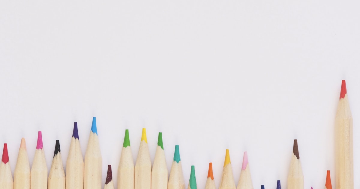
What pencils should you use?
You don't need expensive pencils to practice these techniques. Here's what I'd recommend at different levels:
Just starting out: Crayola Colored Pencils (50-pack, about $8). They're harder than professional pencils, which actually helps beginners because they're more forgiving. You can practice pressure control and layering without worrying about wasting expensive pigment.
Ready to level up: Prismacolor Scholar (48-pack, about $20). Softer than Crayola, better color payoff, and they blend reasonably well. This is the sweet spot for most people.
Getting serious: Prismacolor Premier (72-pack, about $45). Soft, waxy, with pigment that practically jumps off the pencil. They blend like butter. The color range is huge, and they respond beautifully to every technique in this article.
Oil-based alternative: Faber-Castell Polychromos (about $1.50-2 per pencil). Firmer than Prismacolor, with no wax bloom. Excellent for fine detail work and they layer beautifully. More expensive, but you can feel the quality the second you pick one up.
Honestly, you can learn every technique here with a $8 set of Crayolas. Better pencils make it easier and more satisfying, but they're not required.
Pages to practice on
Different types of coloring pages teach different skills:
Start with mandala coloring pages. The repetitive, symmetrical patterns let you focus entirely on technique without stressing about color choices. They're basically drills disguised as fun.
Once your coverage feels smooth, move to flower coloring pages. Petals are the ultimate blending test. You need smooth gradients from light to dark within small shapes, and leaves let you experiment with mixing different greens.
For texture practice, try animal coloring pages like cats and dogs. Short fur, long fur, feathers, scales. Each one demands a different stroke pattern.
And when you're feeling confident, dragon coloring pages and mermaid coloring pages will push you. Metallic scales, iridescent wings, underwater lighting. This is where all the techniques come together.
All of these are free to download and print from our library. Print them on heavier paper (32lb if you have it) for the best coloring experience.
A simple practice routine
If you want to actually improve (rather than just reading about it), here's a practice plan that works:
Week 1: Pressure control. Pick one simple coloring page and color the entire thing using only one color. Focus on creating a range from very light to very dark just by changing pressure. This teaches you more about your pencils than any other exercise.
Week 2: Layering. Pick a page and color each section using at least 3 layers. First layer light, second layer medium, third layer for depth. Change stroke direction between layers.
Week 3: Color mixing. Pick a nature page (flowers or animals work well). For each area, use at least 3 different colors layered together. No area gets just one color.
Week 4: Blending. Use everything you've learned together. Layer your colors, mix your shades, then finish with a blender pencil or white pencil overlay. Compare this to your Week 1 page and prepare to be surprised.
Four weeks, maybe 30 minutes each session. That's the whole program. By the end of it, your coloring will look noticeably different.
The part nobody tells you
Here's the honest truth about coloring with colored pencils: the first few pages you do with these techniques will probably look worse than your usual coloring. That's normal.
When you're thinking about pressure, stroke direction, layering order, and color choices all at once, your brain gets overloaded and the results feel clumsy. It's like learning to type with proper technique after years of hunt-and-peck. There's a temporary dip before things click.
Give it three or four pages. By the fifth one, the techniques start becoming automatic. By the tenth, you won't remember how you colored before.
And honestly, even the "bad" practice pages are still relaxing to make. That's the nice thing about coloring. There's no test at the end. Nobody's grading you. It's just you, some pencils, and a page that slowly fills with color.

Art Educator & Content Director
Art educator with 12+ years of classroom experience. Certified in Art Education and Child Development. Helping families and teachers unlock the power of creative play.
You Might Also Like
Hur man förvandlar ett foto till en målarbild (gratis AI-verktyg)
Hur man konverterar ett foto till en utskrivbar målarbild med hjälp av ett gratis AI-verktyg. Täcker de bästa fototyperna, steg-för-steg-instruktioner, kreativa användningsområden och målarbildstips för anpassade sidor.
Hur man färglägger blommor: tips för realistiska kronblad, blad och buketter
Allt du behöver veta om att färglägga blommor realistiskt: skuggning av kronblad, bladtekniker, ljusriktning, färgpaletter, vanliga misstag och de bästa materialen.
Den ultimata guiden till mandala-målarbilder
Allt du behöver veta om mandalafärgning: val av komplexitetsnivåer, färgplaneringsmetoder, tekniker, material, vanliga misstag och hur man bygger upp en daglig vana.